
YouTube changes constantly. Layouts shift, buttons move, and what looked sharp last year can suddenly feel dated or blurry. Treating your visuals as a one‑time setup no longer works. A better approach is deliberate patience: set strong fundamentals now, then review and refine them as YouTube evolves.
This YouTube image sizes guide 2026 focuses on what actually matters for busy creators and marketers. You get exact dimensions, safe zones that survive redesigns, and practical examples for real channels.
Core YouTube image sizes for 2026
Start with the core assets that define your channel’s visual identity. These are the images viewers see before they ever hit play.
Channel banner (channel art)
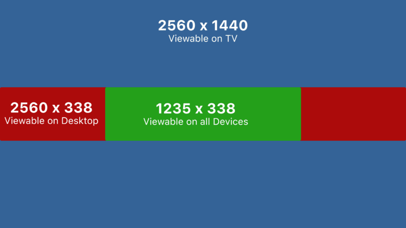
Recommended size: 2560 × 1440 px
Minimum safe size: 2048 × 1152 px
Maximum file size: 6 MB
Format: JPG or PNG (PNG for text and logos)
The channel banner is still the most fragile asset because it crops differently on TVs, desktops, tablets, and phones. YouTube’s interface keeps shifting, but one rule continues to hold: protect the center.
Central safe area for text and logos:
- 1546 × 423 px, centered on the image
Anything critical—logo, tagline, upload schedule—belongs inside that box. On a 55‑inch TV, the full 2560 × 1440 image appears. On a phone, the outer edges get trimmed. If your slogan sits too close to the top or bottom, it vanishes on smaller screens.
Example: A tech review channel wants the phrase “New Gear Every Week” plus social icons on the banner. Place the text dead center, then put social icons just below it, still within the 1546 × 423 px safe area. Background gradients, abstract shapes, or blurred product shots can fill the outer regions, which are more likely to be cropped.
Channel profile picture
Recommended upload size: 800 × 800 px
Displayed shape: circular
Minimum visible size on mobile: roughly 98 × 98 px
YouTube renders the profile picture as a circle, even though you upload a square. Keep every important element inside an inner circle that leaves at least 10–12% margin on all sides.
Practical tips:
- Use a simple mark or headshot, not full text.
- If using initials or a logo, test at 64 × 64 px to check legibility.
- Avoid thin outlines that disappear on dark mode.
Example: A solo creator uploads an 800 × 800 headshot. The face is centered, with the top of the head slightly below the upper edge of the inner circle. Background is a solid, high‑contrast color so the avatar stands out in comments and suggested videos.
Thumbnail sizes that still perform in 2026
Thumbnails remain the main battlefield for attention. The YouTube image sizes guide 2026 still points to one key standard.
Recommended thumbnail size: 1280 × 720 px
Aspect ratio: 16:9
Minimum width: 640 px
Maximum file size: 2 MB
Formats: JPG, PNG, or WebP
YouTube compresses thumbnails aggressively. Starting from 1280 × 720 px leaves enough detail after compression and scaling.
Safe zones and overlays
On desktop, thumbnails appear mostly unobstructed. On mobile and TV, badges and overlays can cover corners:
- Bottom‑right: duration timestamp
- Top‑right: playlists or series badges
- Bottom‑left: progress bar for partially watched videos
Keep key faces, text, and product shots away from the bottom 15% of the image and from the extreme corners.
Example: A tutorial channel uses a thumbnail with a bright background, a close‑up of a keyboard on the left, and bold text on the right reading “Edit Faster in 10 Min”. The text sits above the lower third line, so the timestamp never covers it. The creator’s face overlaps the mid‑left area, away from the bottom edge.
Text size and contrast
Thumbnails now compete on phones where viewers scroll quickly. A good rule is no more than 3–5 words and large, high‑contrast fonts.
- Use sans‑serif fonts at 90–120 pt in the original 1280 × 720 design.
- Test by shrinking the thumbnail to 10% zoom and checking legibility.
- Avoid full‑width text bars that look like spammy ads.
Example: A gaming channel designs a 1280 × 720 thumbnail with the word “IMPOSSIBLE” in bold white text on a dark red bar in the upper third. When reduced to 160 × 90 px, the word still reads clearly on a mid‑range phone.
Community, Shorts, and other image assets
Beyond banners and thumbnails, a modern YouTube image sizes guide 2026 needs to account for Community posts and Shorts, which both rely heavily on vertical viewing.
Community post images
Community posts behave like social feed posts.
Recommended size: 1080 × 1080 px or 1080 × 1350 px
Aspect ratios that work: 1:1 or 4:5
Square images remain safe, but slightly taller 4:5 images occupy more screen real estate in the mobile feed.
Example: A channel promoting a new long‑form video posts a 1080 × 1350 image with a cropped still from the video and a short caption. The main subject sits in the center, leaving enough margin so that no part gets cut off when the image appears in different aspect previews.
YouTube Shorts covers
Shorts pull their cover from a frame of the video or from a manually uploaded image. Treat the cover like a vertical thumbnail.
Recommended size: 1080 × 1920 px
Aspect ratio: 9:16
Key elements belong in the central vertical band, avoiding the very top and bottom where titles, channel names, and UI elements appear.
Example: A cooking channel creates a 1080 × 1920 cover showing a finished dish in the middle third, with the text “3‑Min Pasta” just above center. The bottom 20% remains clean so the YouTube interface does not hide the dish.
Workflow tips for a changing YouTube layout
Image sizes alone do not guarantee a strong presence. The channels that age well treat visuals as a living system instead of a static project.
Build reusable templates
Create base templates for each asset:
- 2560 × 1440 banner with a clearly marked 1546 × 423 safe area.
- 1280 × 720 thumbnail file with guides for the bottom 15% danger zone.
- 1080 × 1920 vertical template for Shorts covers and cross‑platform use.
Design these once in tools like Figma, Affinity Designer, or Photoshop. Then duplicate and adjust for each new video instead of starting from scratch.
Example: A productivity channel maintains a thumbnail template with three layers: background gradient, subject photo, and text. For each new upload, the editor swaps the subject image, updates the 3–4 word headline, and exports at 1280 × 720. This keeps the channel visually consistent even as minor YouTube UI tweaks roll out.
Schedule reviews, not constant tweaks
YouTube’s design language rarely changes overnight. Most updates roll out gradually and keep legacy safe zones intact. Constantly redrawing assets wastes time.
A more deliberate rhythm works better:
- Review banners and thumbnails every 6 months.
- Test new thumbnail styles on 10–20% of uploads before a full switch.
- Check analytics for click‑through rate (CTR) shifts after visual changes.
Example: A finance channel notices CTR dropping on older thumbnails when watched on newer phones. During a scheduled review, the team updates the text style to thicker fonts and stronger contrast while keeping the 1280 × 720 base size. CTR stabilizes without any emergency redesign.
FAQ: YouTube image sizes guide 2026
What is the best size for a YouTube channel banner in 2026?
Use 2560 × 1440 px for the full banner, and keep key text and logos inside the central 1546 × 423 px safe area. This setup still works across TVs, desktops, and phones.
What size should YouTube thumbnails be in 2026?
The recommended size remains 1280 × 720 px with a 16:9 aspect ratio. File size should stay under 2 MB, saved as JPG, PNG, or WebP.
What is the ideal size for a YouTube profile picture?
Upload at 800 × 800 px. YouTube displays it as a circle, so center your logo or face and leave generous margins to avoid cropping.
How big should images for YouTube Community posts be?
Use 1080 × 1080 px for a square post or 1080 × 1350 px for a taller 4:5 image. Both display well in the mobile feed.
What size should a YouTube Shorts cover image be?
Design Shorts covers at 1080 × 1920 px with a 9:16 aspect ratio. Keep the subject and text in the center to avoid overlapping interface elements.


Leave a Reply