
Optimizing Facebook cover photo dimensions is one of the fastest ways to make a profile or page look professional. A blurry banner or badly cropped logo sends the wrong signal before anyone reads a single post. With a few precise numbers and a disciplined workflow, your cover can stay sharp on desktop, tablet, and mobile.
The Correct Facebook Cover Photo Dimensions
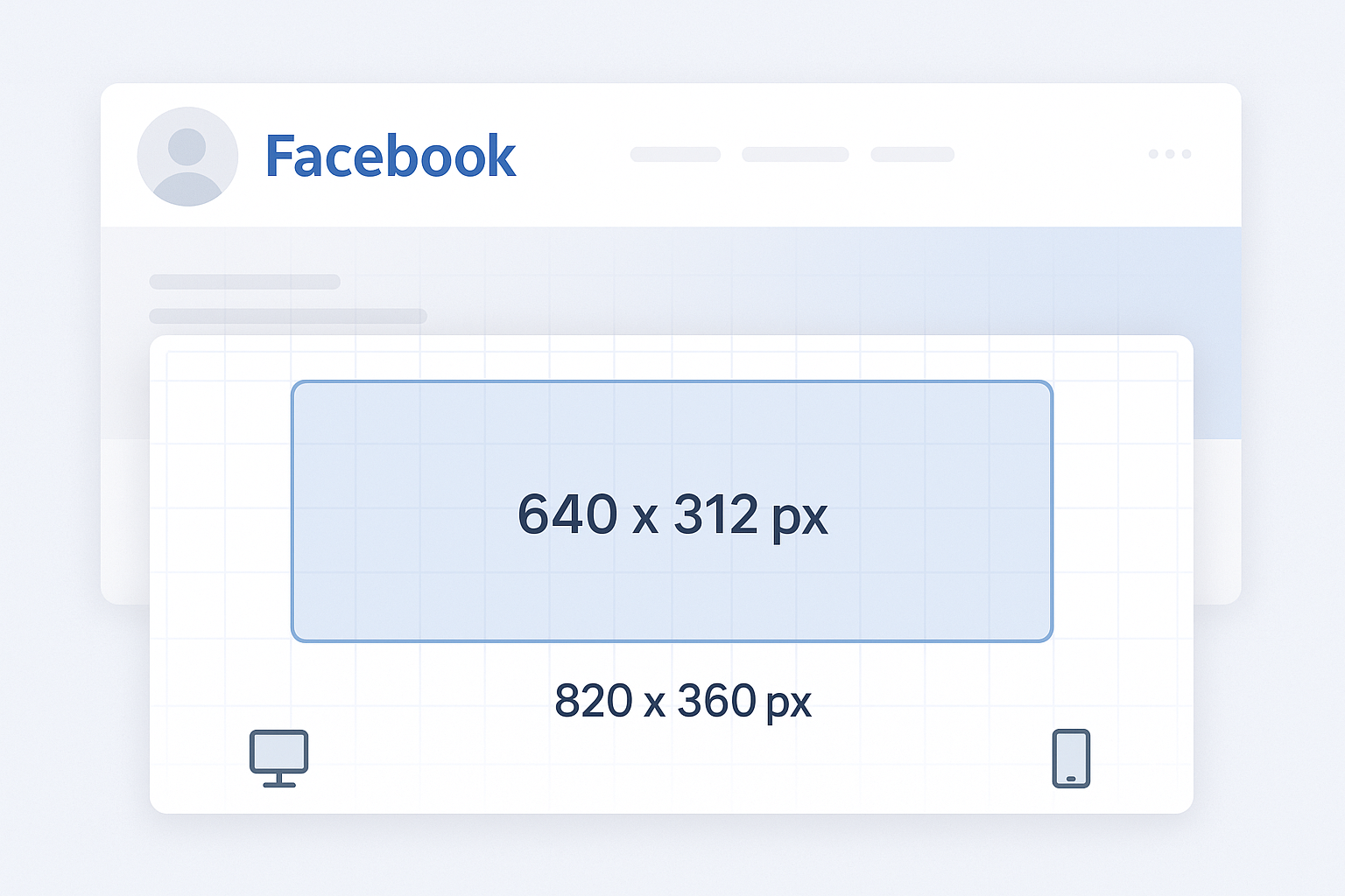
Facebook recommends a cover image that is 820 x 312 pixels on desktop and 640 x 360 pixels on smartphones. To avoid compression artifacts and awkward crops, designers usually work with a single master file at 820 x 360 pixels. That extra vertical space helps protect important content from mobile trimming.
A practical setup looks like this:
- Canvas: 820 x 360 px
- Safe area for text and logos: center band of roughly 640 x 312 px
- File type: high‑quality JPG for photos, PNG for flat graphics or logos
Imagine a local restaurant page. The owner designs a cover at 820 x 360 px, places the restaurant name and tagline inside the middle 640 x 312 px, and keeps the background photo extending to the full canvas. On desktop, the full banner appears. On mobile, the top and bottom edges crop slightly, but the name and tagline remain perfectly visible.
Desktop vs Mobile Cropping: Protect the Safe Area
The challenge with Facebook cover photo dimensions is not only the pixel count. It is the way Facebook crops the image on different devices. Desktop shows a wide, shallow rectangle. Mobile shows a taller slice. Elements placed too close to the top or bottom edges will be cut off on phones.
A reliable approach is to treat the central area as the design safe zone. Keep all critical information—logo, brand name, product shot, call‑to‑action text—inside the center of the frame, away from the edges. Background textures, gradients, or wide scenic photos can fill the full 820 x 360 px canvas.
Consider a SaaS startup page that wants a headline, a product screenshot, and a call‑to‑action such as “Start free trial.” The designer places the headline and button in the middle third of the cover, positions the screenshot slightly to the right, and uses a soft gradient behind everything. On desktop, the full layout appears. On mobile, the gradient and part of the screenshot crop, but the headline and button stay intact.
File Formats, Resolution, and Compression
Correct Facebook cover photo dimensions are only half of the equation. File format and compression determine whether the cover looks crisp or muddy. Facebook compresses uploads aggressively, so the goal is to feed the platform a clean, optimized image.
For photographic covers, use JPG at 80–90% quality. This keeps file size low while preserving detail. For covers with logos, text, or flat color shapes, PNG usually renders sharper edges. Always export at 72 PPI, which is standard for web graphics. Oversized resolution does not create extra sharpness on Facebook; it only increases load time.
Take a gaming community page as an example. The designer exports a 820 x 360 px cover with complex artwork as a JPG at 85% quality, keeping the file under 200 KB. The result loads quickly and still shows detailed character art. A separate version with a flat logo on a solid background goes out as a PNG, so the logo edges stay clean without visible banding.
Practical Workflow to Design a Facebook Cover
A repeatable workflow makes it easier to update covers for campaigns, launches, or seasonal events while staying within the correct Facebook cover photo dimensions.
- Set up the canvas in a tool such as Figma, Adobe Photoshop, or Canva at 820 x 360 px.
- Draw a safe‑zone guide: a central rectangle around 640 x 312 px where all text and logos must live.
- Place the focal point—logo, product, or portrait—slightly off center for visual interest but still inside the safe zone.
- Extend the background to the full canvas so the edges can crop without breaking the design.
- Check desktop and mobile previews. Many tools simulate different aspect ratios; if not, export and upload a draft to a private test page.
- Export in the right format: JPG for complex photos, PNG for crisp graphics, always at the exact Facebook cover photo dimensions.
For instance, a conference organizer might create a master template with the logo locked in the safe zone and a flexible background layer. Each new event only requires swapping speaker photos and dates while the dimensions and placement remain consistent.
Common Mistakes with Facebook Cover Photo Dimensions
Several recurring errors cause covers to look unprofessional, even when the pixel size is technically correct.
One frequent issue is using images that are too small, such as 1200 x 628 px ad creatives, and letting Facebook scale them down and crop them. The result often appears soft or pixelated. Another problem is placing text in the corners, which leads to chopped headlines on mobile.
A regional gym page illustrates both mistakes. The owner uploads a 600 x 315 px flyer as a cover. Facebook stretches it to fit, the text blurs, and the phone number sits in the bottom right corner, partially hidden on mobile. Rebuilding the artwork at 820 x 360 px, moving the phone number into the center band, and exporting as a PNG instantly fixes readability.
FAQs About Facebook Cover Photo Dimensions
What are the current Facebook cover photo dimensions?
The recommended Facebook cover photo dimensions are 820 x 312 pixels on desktop and 640 x 360 pixels on mobile. Designing at 820 x 360 pixels with a centered safe area keeps both views clean.
What file format is best for a Facebook cover photo?
Use JPG for photo‑heavy covers and PNG for designs with logos, icons, or large flat color areas. Always export at the exact Facebook cover photo dimensions to avoid extra compression.
Why does my Facebook cover look blurry?
Covers often look blurry because the source image is too small, heavily compressed, or exported at the wrong aspect ratio. Start with a sharp 820 x 360 px file, keep the quality high during export, and avoid reusing low‑resolution screenshots.
How can I stop Facebook from cropping important text?
Keep all essential text and logos inside the central safe zone of your 820 x 360 px canvas. Avoid placing titles or calls to action near the top or bottom edges, which are more likely to be cropped on mobile.


Leave a Reply